For many apps, search is a key part of creating a seamless and intuitive user experience. When it comes to building Android UIs with Compose, this can be achieved using the Material 3 SearchBar. The search bar component allows us to build a bar that, when focused, expands into a search view to display suggestions or search results.
When used as it comes, the SearchBar works nicely by itself and for large screens there is also a DockedSearchBar. Most Android screens, however, include a TopAppBar that has a background colour that changes when content scrolls behind it.
In this article, we will explore how to build a search experience and then how to embed it seamlessly into a TopAppBar. This allows us to create a polished UI that's perfect for including search into any screen.
The problem
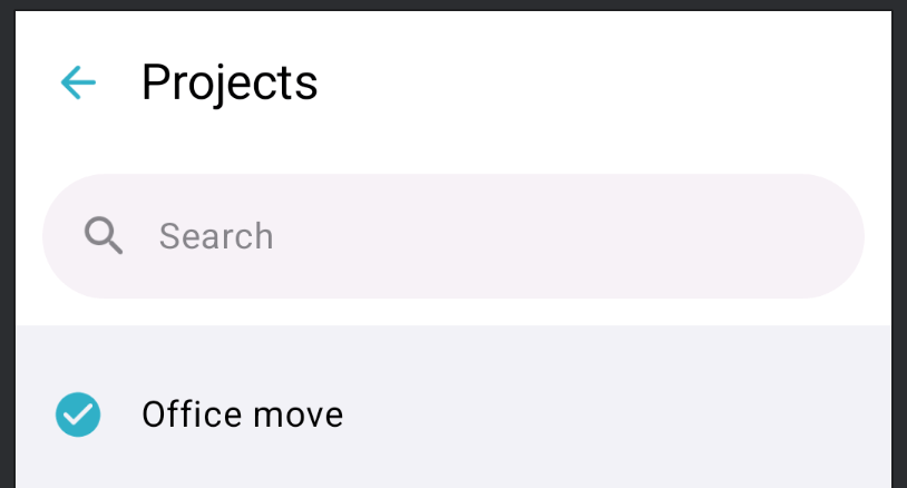
As a starting point, we have a screen within our navigation hierarchy showing a list of projects. The projects list includes a TopAppBar containing a navigation icon and title. We would like to be able to search across these projects, using a persistent search bar within the top bar, below the title.
When we add the search bar below our TopAppBar, it is positioned correctly, however it is visually separate from the top bar.

There are various changes we need to make so that it appears within the bar:
- Add a surface behind the
SearchBarthat matches theTopAppBar. - Match the elevation behaviour, when content scrolls behind the
TopAppBar. - Apply styling when the
SearchBarexpands into a search view.
Building a search bar
Let's start by building our SearchBar.
@Composable
@OptIn(ExperimentalMaterial3Api::class)
fun EmbeddedSearchBar(
    onQueryChange: (String) -> Unit,
    isSearchActive: Boolean,
    onActiveChanged: (Boolean) -> Unit,
    modifier: Modifier = Modifier,
    onSearch: ((String) -> Unit)? = null,
) {
    var searchQuery by rememberSaveable { mutableStateOf("") }
    // 1
    val activeChanged: (Boolean) -> Unit = { active ->
        searchQuery = ""
        onQueryChange("")
        onActiveChanged(active)
    }
    SearchBar(
        query = searchQuery,
        // 2
        onQueryChange = { query ->
            searchQuery = query
            onQueryChange(query)
        },
        // 3
        onSearch = onSearch,
        active = isSearchActive,
        onActiveChange = activeChanged,
        // 4
        modifier = modifier
            .padding(start = 12.dp, top = 2.dp, end = 12.dp, bottom = 12.dp)
            .fillMaxWidth(),
        placeholder = { Text("Search") },
        leadingIcon = {
            Icon(
                imageVector = Icons.Rounded.Search,
                contentDescription = null,
                tint = MaterialTheme.colorScheme.onSurfaceVariant,
            )
        },
        // 5
        colors = SearchBarDefaults.colors(
            containerColor = MaterialTheme.colorScheme.surfaceContainerLow,
        ),
        tonalElevation = 0.dp,
    ) {
        // Search suggestions or results
    }
}- When the search bar receives focus it becomes active and expands. At this point we clear the search term and report the active state change via the
onActiveChangedfunction. Note: if we wanted to keep the search term we wouldn't clear it here. - When the query changes we update the search term state and report the change via the
onQueryChangefunction. - The IME search triggers
onSearch. For now we are updating results whenever the query changes so are simply deactivating the search mode. If we were using a search API request we would perform the search here instead. - Add our search bar padding, sizing and other modifiers.
- Style the search bar appearance, such as background colour.
Position the search bar
The top of the screen is a TopAppBar we have extracted out to ProjectsTopAppBar, which is configured with a back button and title.
Show code for ProjectTopAppBar
ProjectTopAppBar@Composable
@OptIn(ExperimentalMaterial3Api::class)
private fun ProjectsTopAppBar(
onBackClick: () -> Unit,
modifier: Modifier = Modifier,
scrollBehavior: TopAppBarScrollBehavior? = null,
) {
TopAppBar(
title = { Text("Projects") },
modifier = modifier,
navigationIcon = {
IconButton(onClick = onBackClick) {
Icon(
imageVector = Icons.AutoMirrored.Rounded.ArrowBack,
contentDescription = "Back",
)
}
},
colors = TopAppBarDefaults.topAppBarColors(
navigationIconContentColor = MaterialTheme.colorScheme.primary,
),
scrollBehavior = scrollBehavior,
)
}When using the Material 3 Scaffold we can use a Column to position the SearchBar below the bar.
var isSearchActive by rememberSaveable { mutableStateOf(false) }
val scrollBehavior = TopAppBarDefaults.pinnedScrollBehavior()
Scaffold(
    modifier = modifier,
    topBar = {
        Column {
            ProjectsTopAppBar(
                onBackClick = onBackClick,
                scrollBehaviour = scrollBehavior,
            )
            EmbeddedSearchBar(
                onQueryChange = onQueryChange,
                isSearchActive = isSearchActive,
                onActiveChanged = { isSearchActive = it },
            )
        }
    },
) { contentPadding ->
    // Search suggestions or results
}
We now have a SearchBar showing below our TopAppBar, we next need to add a surface behind it so that it appears visually within the TopAppBar.

Surface behind the search bar
The TopAppBar is built with a surface that adapts its container colour based on the scroll behaviour applied to it. We can create a surface to display behind the SearchBar that uses the same styling.
@OptIn(ExperimentalMaterial3Api::class)
@Composable
private fun TopAppBarSurface(
    modifier: Modifier = Modifier,
    // 1
    colors: TopAppBarColors = TopAppBarDefaults.topAppBarColors(),
    // 2
    scrollBehavior: TopAppBarScrollBehavior? = null,
    content: @Composable () -> Unit,
) {
    // 3
    val colorTransitionFraction = scrollBehavior?.state?.overlappedFraction ?: 0f
    val fraction = if (colorTransitionFraction > 0.01f) 1f else 0f
    val appBarContainerColor by animateColorAsState(
        targetValue = lerp(
            colors.containerColor,
            colors.scrolledContainerColor,
            FastOutLinearInEasing.transform(fraction),
        ),
        animationSpec = spring(stiffness = Spring.StiffnessMediumLow),
        label = "TopBarSurfaceContainerColorAnimation",
    )
    Surface(
        modifier = modifier.fillMaxWidth(),
        color = appBarContainerColor,
        content = content,
    )
}- The same
TopAppBarColorswe used in theProjectsTopAppBarabove should be applied to this surface. - The same
TopAppBarScrollBehaviorwe pass into theTopAppBarshould be provided to the surface. - We can animate the container colour based on the scroll behaviour using the same approach as
TopAppBaruses internally.
We can now wrap our search bar in the new TopAppBarSurface, passing in the same scroll behaviour.
topBar = {
    Column(verticalArrangement = Arrangement.spacedBy((-1).dp)) {
        ProjectsTopAppBar(
            onBackClick = onBackClick,
            scrollBehavior = scrollBehavior,
        )
        TopAppBarSurface(scrollBehavior = scrollBehavior) {
            EmbeddedSearchBar(
                onQueryChange = onQueryChange,
                isSearchActive = isSearchActive,
                onActiveChanged = { isSearchActive = it },
            )
        }
    }
}
It seems to render with a tiny 1dp gap between the two bars, so spacedBy((-1).dp) is included for vertical arrangement. If anyone can work out the cause of the 1dp gap please reach out.

Active search view styling
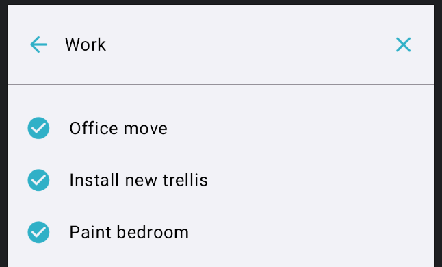
When the SearchBar becomes active it expands to form a search view. We need to hide the TopAppBar whilst search is active and also alter its appearance. We will make a few changes to the call to SearchBar(...).
- When search is active we need to remove the padding we applied earlier.
- We can also animate the content size change to give a clean transition.
modifier = if (isSearchActive) {
    modifier
        .animateContentSize(spring(stiffness = Spring.StiffnessHigh))
} else {
    modifier
        .padding(start = 12.dp, top = 2.dp, end = 12.dp, bottom = 12.dp)
        .fillMaxWidth()
        .animateContentSize(spring(stiffness = Spring.StiffnessHigh))
}
When active, we can replace the leading search icon with a back button to dismiss the search view.
leadingIcon = {
    if (isSearchActive) {
        IconButton(
            onClick = { activeChanged(false) },
        ) {
            Icon(
                imageVector = Icons.AutoMirrored.Rounded.ArrowBack,
                contentDescription = stringResource(R.string.navigation_action_back_cd),
                tint = MaterialTheme.colorScheme.primary,
            )
        }
    } else {
        Icon(
            imageVector = Icons.Rounded.Search,
            contentDescription = null,
            tint = MaterialTheme.colorScheme.onSurfaceVariant,
        )
    }
}
After a query has been entered into the search view, we can show a clear button.
trailingIcon = if (isSearchActive && searchQuery.isNotEmpty()) {
    {
        IconButton(
            onClick = {
                searchQuery = ""
                onQueryChange("")
            },
        ) {
            Icon(
                imageVector = Icons.Rounded.Close,
                contentDescription = stringResource(R.string.search_text_field_clear),
                tint = MaterialTheme.colorScheme.primary,
            )
        }
    }
} else {
    null
}
We can tweak the background colour of the search view when it's active.
colors = SearchBarDefaults.colors(
    containerColor = if (isSearchActive) {
        MaterialTheme.colorScheme.background
    } else {
        MaterialTheme.colorScheme.surfaceContainerLow
    },
)
As the search view is shown instead of the TopAppBar, we need to apply its window insets.
windowInsets = if (isSearchActive) {
    SearchBarDefaults.windowInsets
} else {
    WindowInsets(0.dp)
}
This completes our customisation of the active search view.
Show full EmbeddedSearchBar code
EmbeddedSearchBar code@Composable
@OptIn(ExperimentalMaterial3Api::class)
fun EmbeddedSearchBar(
onQueryChange: (String) -> Unit,
isSearchActive: Boolean,
onActiveChanged: (Boolean) -> Unit,
modifier: Modifier = Modifier,
onSearch: ((String) -> Unit)? = null,
) {
var searchQuery by rememberSaveable { mutableStateOf("") }
val activeChanged: (Boolean) -> Unit = { active ->
searchQuery = ""
onQueryChange("")
onActiveChanged(active)
}
SearchBar(
query = searchQuery,
onQueryChange = { query ->
searchQuery = query
onQueryChange(query)
},
onSearch = onSearch ?: { activeChanged(false) },
active = isSearchActive,
onActiveChange = activeChanged,
modifier = if (isSearchActive) {
modifier
.animateContentSize(spring(stiffness = Spring.StiffnessHigh))
} else {
modifier
.padding(start = 12.dp, top = 2.dp, end = 12.dp, bottom = 12.dp)
.fillMaxWidth()
.animateContentSize(spring(stiffness = Spring.StiffnessHigh))
},
placeholder = { Text("Search") },
leadingIcon = {
if (isSearchActive) {
IconButton(
onClick = { activeChanged(false) },
) {
Icon(
imageVector = Icons.AutoMirrored.Rounded.ArrowBack,
contentDescription = stringResource(R.string.navigation_action_back_cd),
tint = MaterialTheme.colorScheme.primary,
)
}
} else {
Icon(
imageVector = Icons.Rounded.Search,
contentDescription = null,
tint = MaterialTheme.colorScheme.onSurfaceVariant,
)
}
},
trailingIcon = if (isSearchActive && searchQuery.isNotEmpty()) {
{
IconButton(
onClick = {
searchQuery = ""
onQueryChange("")
},
) {
Icon(
imageVector = Icons.Rounded.Close,
contentDescription = stringResource(R.string.search_text_field_clear),
tint = MaterialTheme.colorScheme.primary,
)
}
}
} else {
null
},
colors = SearchBarDefaults.colors(
containerColor = if (isSearchActive) {
MaterialTheme.colorScheme.background
} else {
MaterialTheme.colorScheme.surfaceContainerLow
},
),
tonalElevation = 0.dp,
windowInsets = if (isSearchActive) {
SearchBarDefaults.windowInsets
} else {
WindowInsets(0.dp)
}
) {
// Search suggestions or results
}
}
Wrap up
We have built a SearchBar that appears embedded within a TopAppBar that expands into a full-screen search view when focused. The SearchBar is a very customisible component and Jetpack Compose makes it easy to achieve the design we want. This search bar component can now be used throughout our apps to add search to any screen we want.
I hope the article was useful. If you have any feedback or questions please feel free to reach out.
Thanks for reading!
WRITTEN BY
Andrew Lord
A software developer and tech leader from the UK. Writing articles that focus on all aspects of Android and iOS development using Kotlin and Swift.